
Over the past few weeks, I’ve been busy with the preparation and the coordination of the social reporting team for the ICT4Ag conference in Kigali. I'll blog separately about the process and learnings (actually, a lot!) in terms of both technology and people for a successful social reporting effort.
But if you are interested in discussing Twitter reach and online engagement around the event, please stay with me for a few minutes and keep reading.
The starting point for this conversation is the post that my friend and colleague Pete Cranston published few days back. I’m grateful for the questions he poses, as they couldn't provide a better framework for my reflection.
Together with the reach (defined as "the number of unique followers that a users has - and so the unique number of people that a tweet could potentially get to"), Keyhole also tracks impressions, number of posts and number of users that have contributed content around #ict4ag13. So if we look at this full picture, the headline figures are even more impressive, with over 12 million impressions, from 11,900 posts contributed by 1,272 users.
So what does it mean to reach these people? And do these numbers really matter?
On the one hand, if I look only at these figures, I am very pleased with the results - and I am indeed including these figures in my report back to CTA! And not just because I believe in ‘vanity metrics’ (in fact I don’t, as you’ll read) but for the reason that these numbers could be enough for me to say that the objective of the social reporting project - in terms of raising online awareness on the topics/sessions of the conference, update the online audience on the conference proceedings and engage them in the discussion - were met.
But I want to move beyond the numbers or - as Pete put it - "avoid the risk posed by pure, refined white sugar."
Keyhole itself provides some useful indicators that go in this direction. Indeed, it gives you insights on the contents that are shared (at the level of domains and individual links). It also provides a useful map that show where the conversation around the hashtag are happening, the demographics of contributors and the share of posts between original posts, retweets and replies.
To me these are already very interesting analytics and they provide a much richer picture of the online conversation around an event - and how users engage with it.
However, if you want to understand more about the value of social media for events and where different users position themselves on the ladder of engagement, especially when we look at Twitter conversations, I think different approaches are needed.
I am not going into the technical details of how this works (Martin does a pretty good job himself in explaining how to setup and use this script). As for the technical problems I have encountered, this will be in follow-up posts.
Again, I’d like to focus here on the results, and show you how different the picture looks like if you add another layer of analysis to the data available.

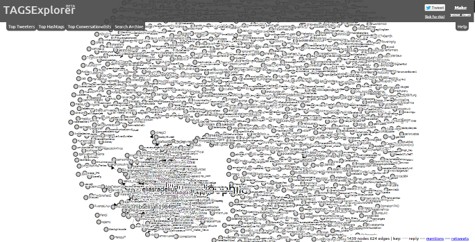
(Note - An interactive version of this visualization is available online but sometimes it may take long to load. You can hover over a node to see a summary of the data recorded in the archive. By clicking on the node you can see the conversations that person had condensed into 30 seconds)
As you can see in the image above, this visualizations shows the conversations between Twitter users around #ict4ag13 - producing a network analysis where the different nodes represent users and the connections between them is determined by the replies and conversations between them - instead of just retweets.
While this is probably not perfect - the visualization for example could be improved to have a more clear picture - I think this is very useful to evaluate the conversation around Twitter. In the case of the ICT4Ag conference, while many users contributed content, not all of them had been engaging in conversations - rather this happens amongst a core, central group of users, while many more remain at the periphery, broadcasting, engaging with the content of the conference but not really exchanging with one another.
By Pier Andrea Pirani - Join Me on Google Plus
But if you are interested in discussing Twitter reach and online engagement around the event, please stay with me for a few minutes and keep reading.
The starting point for this conversation is the post that my friend and colleague Pete Cranston published few days back. I’m grateful for the questions he poses, as they couldn't provide a better framework for my reflection.
It’s two million, actually...
On one thing Pete is not not correct though. According to Keyhole, the tool we used to track the conversations around the conference hashtag #ict4ag13 (on Twitter, Facebook and Instagram) the total reach is over 2 million!Together with the reach (defined as "the number of unique followers that a users has - and so the unique number of people that a tweet could potentially get to"), Keyhole also tracks impressions, number of posts and number of users that have contributed content around #ict4ag13. So if we look at this full picture, the headline figures are even more impressive, with over 12 million impressions, from 11,900 posts contributed by 1,272 users.
(click to enlarge image)
 |
| #ict4ag13 real-time tracker with Keyhole - 12 Oct-11 Nov. 2013 |
On the one hand, if I look only at these figures, I am very pleased with the results - and I am indeed including these figures in my report back to CTA! And not just because I believe in ‘vanity metrics’ (in fact I don’t, as you’ll read) but for the reason that these numbers could be enough for me to say that the objective of the social reporting project - in terms of raising online awareness on the topics/sessions of the conference, update the online audience on the conference proceedings and engage them in the discussion - were met.
But I want to move beyond the numbers or - as Pete put it - "avoid the risk posed by pure, refined white sugar."
Keyhole itself provides some useful indicators that go in this direction. Indeed, it gives you insights on the contents that are shared (at the level of domains and individual links). It also provides a useful map that show where the conversation around the hashtag are happening, the demographics of contributors and the share of posts between original posts, retweets and replies.
To me these are already very interesting analytics and they provide a much richer picture of the online conversation around an event - and how users engage with it.
However, if you want to understand more about the value of social media for events and where different users position themselves on the ladder of engagement, especially when we look at Twitter conversations, I think different approaches are needed.
Tracking engagement, mapping conversations
While preparing for the event, I spent quite some time researching online for tools that could allow me to archive all the tweets around #ict4ag13, and to do some more analysis beyond the usual suspect metrics. I was looking for a free tool, and after several searches - and testing some applications - the right query string finally landed me to this post by Martin Hawksey, where he presents a way to archive AND visualize tweets, automatically pulling results from a Twitter Search into a Google Spreadsheet.I am not going into the technical details of how this works (Martin does a pretty good job himself in explaining how to setup and use this script). As for the technical problems I have encountered, this will be in follow-up posts.
Again, I’d like to focus here on the results, and show you how different the picture looks like if you add another layer of analysis to the data available.
(click to enlarge image)
As you can see in the image above, this visualizations shows the conversations between Twitter users around #ict4ag13 - producing a network analysis where the different nodes represent users and the connections between them is determined by the replies and conversations between them - instead of just retweets.
While this is probably not perfect - the visualization for example could be improved to have a more clear picture - I think this is very useful to evaluate the conversation around Twitter. In the case of the ICT4Ag conference, while many users contributed content, not all of them had been engaging in conversations - rather this happens amongst a core, central group of users, while many more remain at the periphery, broadcasting, engaging with the content of the conference but not really exchanging with one another.
Show off but connect the dots!
So while I am definitely using some ‘vanity metrics’ in my report back to CTA I think that a fair assessment of social media engagement around an event like in the case of ICT4Ag needs to look beyond just these numbers. It needs to map the conversations and the contents that are shared. Most important, once you have these information, it is critical to act on it and spend more attention into enlarging the conversation, to making sure that each contributor does not talk to himself but engage with others - or to put it another way, that each dot has at least a line that connects to it.By Pier Andrea Pirani - Join Me on Google Plus