Google+
Showing posts with label digital. Show all posts

Tuesday, August 30, 2016

How are development organizations using Google Analytics?

In the previous post, I described the importance of having a digital analytics measurement plan and I presented some essential elements for correct and efficient use of Google Analytics (GA). However, recent work I’ve conducted make me wonder how advanced (or not) the use of digital analytics - and GA specifically - is amongst development organizations. My recent experience was limited to 6 organizations (different in size, resources and capacities) so the sample is clearly limited. But some trends are probably more common than not.

Google Analytics

Google Analytics is not always used to its full potential 

In reviewing how different websites use GA, I discovered huge differences. For some organizations, the setup of Analytics is far from optimal. For example, one organization didn’t have a great understanding of the differences between GA account, profile and property, which resulted in unstructured proliferation of accounts.

The use of different reporting views, as well as filters and advanced segments is also not very common. This means that Analytics data are just analysed in aggregate, without telling you much about the specific audience you intend to reach. For example, if your website is targeting users in North Africa and the Middle East, you need to be able and single out traffic from these regions, to better analyze your target audience.

Tracking goals and ‘conversions’ is not always common practice. Goals can be set up in various ways in GA to track users’ interaction with the website - when they scroll on the page, click a link, decide to print a page, comment or spend a certain amount of time on the page. This can provide a great deal of information to website managers and editors, to improve the way information is presented and webpages are organized, as well to increase users’ engagement.

Only one out of 6 organizations stood out in using an advanced configuration of Google Analytics to create different reporting views, filter data, track goals and conversions.

Google Analytics too often stands alone 

I have highlighted before the importance of a digital analytics and measurement plan - and how Google Analytics may eventually just be a part (even if the most important) of your data collection and analysis system. On the contrary, I didn’t find a lot of this in the websites I’ve recently reviewed.

On the one hand, while Analytics is the default tool to track digital analytics, in most cases is also the only monitoring tool. On the other hand, when digital analytics are collected from different sources, (e.g. website, newsletter, RSS feeds, social media, etc), more often than not they are not presented and analysed in aggregate. Finally, not all organizations are regularly producing actionable reports on the basis of their analytics, to inform future actions and improvements on the website.

Only one organization presented a more advanced understanding of its’ digital analytics process, with multiple data collection points (e.g. website, newsletter, RSS feeds, social media, etc) that fed into a dashboard spreadsheet, using formulas and calculations to avoid double counting and over-reporting of metrics. Even if there was no document describing a strategy, this is already a great step towards more efficient use of digital analytics.

What can be done? 

I think a lot could be achieved through the availability of more specific content for international development and the open exchange of experiences around digital analytics for the development sector.

The majority of information and guidance available online, while comprehensive, in general tends to focus on e-commerce and more business oriented websites. Other sources such as the Digital Analytics Programme (DAP) provides a good example of guidance and best practices, training and support in digital analytics. However, the target audience is also very specific, DAP being designed for US Government government agencies that provide information to the public. Eventually, there is not much available that focuses specifically on digital analytics for development - and information and knowledge services specifically.

Secondly, I think website administrators and managers should be more open about how they do digital analytics, as ODI has been doing by sharing their M&E dashboard. Knowledge sharing and learning opportunities should be created for users to exchange notes and learn from each other, to identify good practices and examples that can be replicated. Ideally, I believe that web managers should also be open about the actual number of their website stats. Especially for publicly-funded websites, this would mean more transparency and the possibility to compare and benchmark different websites.

Finally, I think donors should play their part in fostering better use of digital analytics in projects and programs they fund. Besides acting as convenor for peer learning initiatives around good use of digital analytics, donors should provide stronger guidance and support in this area, to make uniform data tracking and collection across different projects. Ideally, for donors’ funded websites and knowledge services, there should not just be the mention of few, poorly selected web metrics in the project logframe. A digital analytics and measurement plan should be developed as part of the project inception phase.

In the next post in this series, I’ll look specifically at what metrics and indicators could be most useful, amongst the dozens available, for development websites and knowledge services.

Monday, August 22, 2016

Understanding digital analytics

In the past few months, two different projects gave me the opportunity to spend quite some time working on Google Analytics. The projects were different in scope: in the first, I was asked to review the use of Google Analytics as part of the monitoring and learning system of a think tank; the second project was part of a larger evaluation of development information services, to understand the reach and use of different websites. Overall, I was able to review how 6 different development organizations are currently making use of Google Analytics to track web traffic and users’ interaction.

digital analytics

This is the first post in a three post series where I’ll share some of the learning from this recent work. I’ll start with some key points for efficient use of Google Analytics (GA). Then in the second post I’ll present examples of how different organizations are using GA. Finally, in the third and final post in the series I’ll zoom in more into Google Analytics metrics - and measuring what matters to you.

Google Analytics - from basic to advanced use 

GA has developed a rich and sophisticated toolset over the years. It is now one of the most commonly used tools to monitor website traffic and engagement. It’s probably the industry standard for web analytics across different business domains, such as e-commerce, government, education, and development, too. While some have questioned the accuracy of Google Analytics and there’s no shortage of alternatives tools out there, in my opinion Google Analytics remains one of the most powerful tools (for everyday use, especially in smaller organisations). One of the aspects I like most about Analytics (besides the fact that it’s free…) is its continuous improvement - in terms of its own features and functionality as well as integration with third party tools (such as Supermetrics), and integration with Google Sheets add-ons.

Help! 

I recognize GA features can be overwhelming: with all the information GA can track it’s easy to drown in a sea of data. Luckily, a simple search in Google will return a lot of results pointing you to tutorials, guides and training videos that will allow you to go well beyond a basic knowledge of Analytics. If you’re new to Google Analytics, or want to take it to the next level, I suggest you take a look at these resources:

As a minimum requirement, your correct installation of Analytics should include:

Analytics measurement plan

It’s relatively straightforward to get your Analytics set up properly and tracking data. But this is just a small part of the job. In fact, even before you get going with Google Analytics (or any other web analytics software), what you need is a measurement plan.

A measurement plan is a document that:
  • Defines your business objectives and outcomes you want to see; 
  • Presents the strategies and tactics to reach these outcomes;
  • Illustrates the metrics you need to monitor and the tools and processes to collect data; and
  • Includes goals and targets for your selected measures. 
In this sense, Google Analytics is only one of the different tools that you have to measure your objectives and outcomes. If you’re active on Facebook and Twitter or publish video on YouTube, these should also find a place in your measurement plan.

There’s a lot of good resources out there on digital analytics and measurement planning. You can check Google’s own guides or this post from analytics specialist Avinash Kaushik. Finally this guide presents a great intro for non-techie on how to create a measurement plan for Google Analytics.

So as essential as a measurement plan may seem, my recent work experience tells me that this is probably more the exception than the norm in development organizations. I’ll discuss more about this in my next blog post. In the meantime, how would you consider your current use of Analytics? Are you using it to its full potential? Do you have a digital measurement plan? Let me know in the comments below!

Thursday, July 21, 2016

Building a knowledge portal through Open Data

The Open Knowledge Hub (OKHub) is a collaborative initiative led by IDS to make good quality research accessible in an original way.

In its essence the OKHub is a “database of open-licensed metadata (bibliographic data and links) about research documents, organisations, and other materials.” Around 20 knowledge partners such as Eldis and 3iE contribute their content to the platform, including titles, URLs, abstracts and summaries, keywords, etc, of the research publications in their catalogues. To date, the OKHub contains over 20767 documents. You can browse and search this wealth of information by different criteria (e.g. themes, languages, regions and countries, etc.) on the Content Explorer.


But collecting, aggregating and organizing this global content is only half of what the OKHub offers. In fact, the OKHub uses the same open infrastructure and technology to allow you to use its content to set up your own knowledge services. Services such as BRIDGE and the Gender Hub are integrating OKHub contents to expand their online collections.
Earlier this year I supported the development of a prototype website that makes use of the OKHub dataset and functionality to presents selected research on Challenges to Development in the Arab World.

Setting up the prototype 

The OKHub offers functionality for developers and site ‘builders’ to re-use its content. You can use a simple HTML widget to display selected resources from the OKHub catalogue. Alternatively, if your website is built on Wordpress or Drupal, you can use a plugin to seamlessly import selected contents from the Hub into your own site.

For the Challenges to Development prototype, we experimented both with solutions. Eventually, as the site is build on Wordpress, we downloaded and installed the OKHub plugin to import around 140 free Open Licensed content items relevant for the 10 key issues covered by the prototype. These contents are aggregated on the resources page and presented separately on each thematic page. 


Together with this open content imported from the OKHub, the proof of concept also provides two spaces for content creation and curation: a section to present featured publications and a blogging space to share relevant highlights from the MENA region.

This project was rather short and straightforward, but there are three key lessons that I think it’s worth sharing.

A business case for the OKHub initiative and platform 

Actually, two. On the one hand, as knowledge producer or intermediary, you can make use of the OKHub technology and infrastructure to contribute the content of your organization, thus increasing its visibility, availability and accessibility. On the other hand, The WP plugin has huge potential, as it allows non programmers to easily import content and augment their own knowledge service, or create a new one.

The human factor

Open content and automation alone are clearly not enough. If you want to maximise the chance of research uptake, the human factor is key. This means using a moderator with the required regional or thematic knowledge for quality control purposes and to tailor imported content to specific stakeholders. But it also means having resources to create your own original content, to curate and repackage existing content, to build and animate a community around your service, to ensure users are interested and engaged.

Tech for the (non-)techie

The HTML widget and WP plugin enable less technical people, with a basic knowledge of HTML and CMS, to “plug-and-play” and build applications which meet their needs. However, you may still need some programming skills, to be able to fully integrate OKHub content on your own site. In my case, there was a conflict between the WP plugin and the site theme, resulting in individual records not fully displaying, or altering the site layout. Thanks to our colleague Tony Murray for stepping in and getting well beyond where my technical knowledge ends!

Overall, the prototype offers a good proof of concept for the idea that open knowledge and collaborative approaches can help extend outreach and uptake of research knowledge.

Do you know other examples on initiative of knowledge services based on Open Data to sharing and use development research content? Let us know in the comments below!

Monday, July 18, 2016

Audit your Google Apps with GAT

For a couple of years, we’ve been supporting the deployment and adoption of a KM platform for the Collaborative Adaptation Research Initiative in Africa and Asia (CARIAA). As the programme has evolved and matured, so has the platform, with almost 500 user accounts, and anecdotal evidence of its usefulness to support knowledge sharing.

But besides counting the user accounts created, what is really happening on the platform? Can we learn more about the users? What are they contributing? Is there any champion emerging? What Apps are most used?

Go beyond Admin Reports 

Google provides its own reporting functionality through the admin panel. If you have a domain admin account, you can access Reports and track Apps usage, security, accounts activity, etc. The reporting features are rather rich and are a perfect fit for ongoing monitoring of the platform. However, Google Reports allows you only to look at data for the previous 6 months period - which is probably not enough if you want a comprehensive picture of how the platform has evolved over time, and what users have been doing with it.

For this purpose, the best solution we could find is the General Audit Tool (GAT).

Launched in 2010, GAT is primarily an auditing and it monitoring tool. It allows you to audit or report on over 250+ separate items for users, documents, email, calendars, sites, groups, etc. Additionally, it counts users’ collaboration activities and calculates a ‘collaboration index’ across your domain, using multiple indicators such as file shares and file visits. Finally, you can set up alerts to get notified if domain policies are not followed - for example, when documents are shared outside the domain. The animated video below provides some more background information on GAT and what it is good for.


GAT comes with a cost, depending on the number of active Google Accounts you have on your domain. However, it also offers a full features trial. If you are using Google Apps, I recommend you test it out and find what it can do for you.

How we used GAT 

GAT helped us to extract a large amount of specific information on users, the frequency they interact with the Apps, and how they work with other users.

We run several daily GAT scans over a period of two weeks and exported several datasets from the Apps and metrics we had decided to include on our analysis. We then loaded this data into Tableau, to be able to aggregate it, segment it, analyze it and make sense of it through charts and tables.

You can read below here some highlights from our analysis:

  • The growth of and demand for new accounts has been steady and well beyond the initial expectations. 
  • The majority of users are active, with 75% of them that logged onto the platform at least once in the past 6 months, and over half of them in the first quarter of this year.
    Date last login
  • The use of the platform has been increasing over time. However, this use is unevenly distributed, with some users clearly emerging as platform champions
  • Google Drive is by far the largest app is terms of usage and the most frequently accessed by users, followed by Calendars and Hangouts. Drive currently hosts over 23K files and folders. The primary function of Drive appears to be to store and archive documents; the creation of new content is secondary. About 50% of all files on shared Drive have been created elsewhere and then uploaded onto Drive. 
  • An increasing number of users are viewing and editing documents on Drive, confirming the adoption of the tool. However, collaboration appears to be limited to a small number of documents, while the great majority see a small number of ‘actions’ (views or edits) performed by an equally small number of users.
    Docs overview: number of users, edits and visits per quarter 
  • In several instances, users are contributing to the CARIAA platform with their personal Google account instead of their CARIAA account. This has potential negative implications in terms of sharing settings, document management and overall platform M&E. 
This is very much a work in progress, we’re learning as we go and constantly testing out new options. What’s good about our progress so far is that we’re generating the kind of longer-term, trend data that really helps us provide support and the client to adapt to evidence about pattern use. And once it has been set-up it is not too time-consuming.

Of course a lot of these features are available in those expensive all-in-one packages used by commercial organisations and the deeper-pocketed big NGOs. But it’s hard work keeping up with trends and providing accurate, useful, timely data on a smaller budget, one more typical of the mass of Development players. So help us - what tools and approaches have you found useful and can share? And are your clients or service users listening to you and the data and changing how they work?

Monday, October 19, 2015

Four useful tools to monitor Twitter use and engagement

If you search on Google for “Twitter monitoring tools” you’ll probably get a lot of blog posts and resources with links to tools such SocialBro, Crowdbooster, TwitterCounter and many more. And of course don’t forget Twitter Analytics itself, available to all users for a little over one year now, that allows you to track engagement on your timeline activity and followers growth.

However, for most popular uses there are limitation in terms of free use and you’ll have to purchase a subscription to use all their features. And Twitter Analytics doesn’t give you all you may need in terms of tracking Twitter use and engagement. For example, you may need to track activity around a specific hashtag or Twitter account, around an event or an online campaign. Or to analyze the Twitter users in a specific list. Or to monitor the number of followers and growth of several accounts, some of which are created and managed by others.

For several of the projects I’ve been working on in recent months, I had to spend some time looking at possible solutions to these needs. After some researching, testing and experimenting, here are four useful tools that you can use to enrich your digital analytics around Twitter.

Keeping track of Twitter followers numbers 

Example dynamic followers count 
 While number of followers to a Twitter account may not be by itself very meaningful as a metric to track users’ engagement, it is still a quick, useful indicator of your ability to connect and expand your audience. Tracking Twitter followers numbers is easy when you have to look at the followers of just one Twitter account. But what if you need to monitor and aggregate the followers of several Twitter accounts, how can you easily do it?

After some searching and (several) failed tests with different solutions, I finally came across this excellent Google Script created by Sarah Marshall. After you setup and configure the Script, you’ll be able to automatically add Twitter followers numbers to a Google Spreadsheet, for as many Twitter account as you need.

This is a great tool to have a quick overview of the followers of different Twitter account at a glance. Moreover, Sarah has kept updating the Script, whenever Twitter has changed the way its API works.

Exporting Twitter lists 

TwExList is an excellent service to export a wide range of information from Twitter. For example, you can export information such as followers and following, tweets, mentions and favourites of your own Twitter account or of another user account. Likewise, you can export information around a Twitter list, regardless of whether you have created the list or not.

Example TwExList Excel export - click to enlarge the image

Very simple to use, in four easy steps TwExList offers you different options - from Excel and CSV to html - to export the data you’re interested.

Given the many different types of information that you can export using TwExList, there are many, many ways in which this tool can come in handy. For example, you can analyze your Twitter timeline posts, to see which one created more engagement (retweets and favorites); or you can inspect your followers - or the members of a list - to see influencers and active users . Finally, you can use this service to keep an eye on your ‘competitors’ and see how they are using Twitter, the kind of following they have and how they create and sustain engagement.

The service is free to test, limiting the export to the last 50 tweets in a list. Different pricing options are available from single to unlimited exports.

Monitoring Twitter engagement 

Two very useful tools you can use to measure engagement and track conversations on Twitter are Zapier and TAGS.

Zapier connects web services and apps to automate ‘actions’ between them on the basis of defined triggers. For example you can use Zapier to connect Twitter and Google Drive so that each new engagement action (mention, RT or reply) around a Twitter handle or around a hashtag is recorded and added as a new row in the connected spreadsheet. Amongst others, information that can be recorded includes: post link; user name and location, RT counts, etc...Pricing plans for Zapier start with a free account, for 3 Zaps and up to 100 records/month. Paid accounts start at $15/month for 10 Zaps and 3000 records/month.

Use Zapier to connect Twitter and Google Sheets - click to enlarge

A great alternative is TAGS, the free service developed by Martin Hawksey. TAGS (short for Twitter Archive Google Spreadsheet) is a Spreadsheet Template that users can easily copy and configure to suit their needs to track mentions and search terms on Twitter, and automate the collection of these results.

One of the things I love about this service is that, together with a worksheet collecting the various tweets, the spreadsheet template comes with a summary and dashboard sheet already built in, so you don’t have to worry about setting this up but can start focusing on the analysis of your results immediately.

Example of TAGS dashboard
Additionally, TAGS comes with two nice add-ons: a searchable, online archive of the tweets collected and an explorer to visualize the engagement and connections between different users.

Example of TAGS searchable archive - click for live version
While I’ve started using TAGS as part of the toolkit to monitor online engagement for social reporting around events, increasingly I’m recommending it as a good solution for ongoing monitoring and evaluation of a specific Twitter handle, or a particular hashtag or search term.

What other tools do you use to support and complement your Twitter Analytics?

Wednesday, August 12, 2015

Using a self hosted Wordpress site for project communication

When we’re asked to set up a blog to support projects, most of the time the choice is a simple free installation at wordpress.com. However, once we’d identified the functions that we wanted to support with technology in our KM activities for the BDS program, we quickly realized we would need more functionality and features than the ones available on a free WordPress blog. So we opted for a self-hosted version at wordpress.org - and made use of the dozens of plugins that are available to expand your WordPress blog into a rich, complex website.

There are tons of posts out there on the pros and cons of self hosted solutions, and step by step guides to installation and hosting. There’re also an awful lot of resources about essential WordPress plugins you should be using on your site. So we won’t cover any of these topics in this post. Instead, we’ll be looking at 3 plugins that we’re using to expand the BDS KM site beyond its core blogging functionality.

Custom taxonomy and categories 

The first function of the bdskm site is to act as publishing platform for the selection of monthly curated updates about water, sanitation and hygiene (WASH). We wanted these updates to be properly categorized, according to type of resources, geographical and thematic coverage. And we wanted to make it easy for our curator to apply these categories, by choosing from a list or drop down menu. So we needed something that goes beyond the (useful but rigid) standard combination of WordPress tags and categories.

Installing the plugin WCK - Custom Fields and Custom Post Types Creator allows you to create additional taxonomies for your website. Most importantly, you can do so without having to touch any piece of code.

In our case, we defined three custom taxonomies for type of resources, geographical and thematic coverage. These can be easily selected by authors when they post new content on the site.

Further, we reflected this custom taxonomies in the front end of the site. Adding the plugin in Search and Filter, we could expand the search functionality, allowing users to filter and display content for each of the categories included in our new taxonomies.

Five stars rating widget 

Another key specification for the Curated Updates part of the website was the introduction of a simple content rating system. We wanted to give readers the possibility to assess and rate the content published monthly on the site, through a rating or start system. This had to be as easy as possible for readers, meaning no login should have been required for them to cast their vote on a specific article. 

The Rating-Widget Star Ratings WordPress plugin allows to you to embed and display star ratings after each post or page on your WordPress website. You can customize style, theme and colors, fonts etc. of the ratings. You can also display the 'Top Rated' content as a widget on your site sidebar or footer.

The plugin comes with a free version and several possible upgrade option. In this case we purchased the Professional version (8 USD/month) which, among other features, gives you a very useful dashboard to monitor ratings. All data can be also exported in a zip file.


Private content area 

The last and third functionality we wanted to add to the bdskm site is the creation of a private content area, accessible only to the core group of project participants. In our plan, this would allow for a more intimate interaction and dialogue between project participants, where they would share their reflections about learning from the project, and how they are learning about the way they learn.

There are many ways in which a private content area can be created on WordPress, and several plugins do this job. After some research and a little more testing, eventually we opted for using the User Access Manager plugin.

With this plugin, you can create user groups and specify what site content each group has access to. User accounts are created via the WordPress dashboard, and they are added to a specific group. As a convention, we set up the users accounts with their email as login name and use a standard password that they could change after their first login. Using their account details, users could access any restricted content page or post.


While we use a dozen other plugins on the bdskm website, the three illustrated above here demonstrate how flexible and scalable WordPress is, and how much you can do with it. With WordPress it is really easy to make the site do what you need it to, even without being a programmer or webmaster.

Monday, July 20, 2015

Three tools to support communication and learning in a KM project

One of the projects that has kept us busy over the past 15 months is the support and facilitation of KM activities in the Building Demand for Sanitation (BDS) programme. The project has different components and activities and, from its inception, we looked at how technology could support communication and learning in and around the project. This blog post will provide a quick overview of three of the tools that we’ve been using in this KM project.
BDSKM blog - click to enlarge


3 simple principles for technology selection 

But before we go into technology, here are some of the principles that guided our selection of possible digital tools:

  1. Know your audience. We engaged with grantees in the early stage of the project, to understand their current behaviours in terms of information, knowledge sharing and communication. 
  2. Tools follow functions. In one early meeting in the process, grantees defined specific KM activities they were interested in. From this, we mapped out a series of possible tools to be used, selecting the most appropriate and accessible. 
  3. Private and public spaces. While we tend to favour the creation of ‘open’, public online spaces there was a specific need in this project for two kinds of spaces. The first is a more protected space, to enable people to share tentative or critical ideas that they would not like necessarily to share in a more open space. At the same time we wanted other spaces that are more public, to be able to interact and engage with a larger online audience. 

Tech overview

To support and enable communication and learning, we opted for a simple, straightforward digital system using 3 tools:

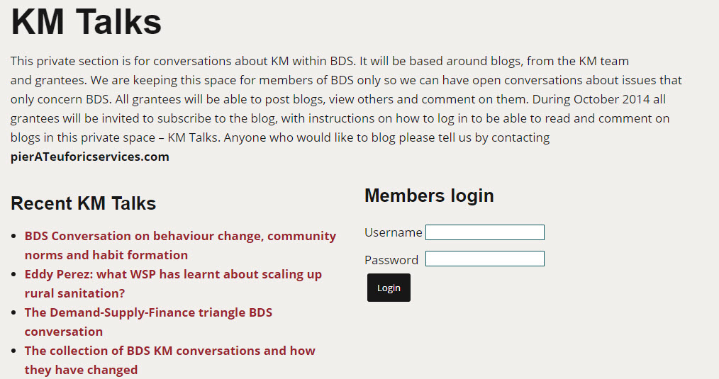
  • A Wordpress blog - Publicly available at bdskm.net, this simple blog is the digital home for the project. It offers different online spaces, such as the Curated Updates, which are openly accessible for anyone on the Internet. Other pages, such as the KM Talks and its subpages, are private, only accessible to the core project participants. In these private pages, participants share their reflections about learning from the project, and learning about the way they learn
  • A Dgroup community - With membership by invitation only, it includes again just the closer circle of participants directly involved with the project and the KM support team. The Dgroup is key in supporting different types of communications in the project: from informal information sharing between group members, to facilitated and focused e-discussion on specific questions, to reflections and learning stories emerging from other activities in the project. 
  • A Mailchimp newsletter - The newsletter is sent on a monthly basis, presenting the content that is published in the Curated Updates section of the blog. Initially sent to the core group of project participants, its membership has grown beyond this reduced number of recipient to reach about 160 WASH professionals, a good indicator of the relevance and value of this service, as reported in a previous blog post. 
Around this core, simple toolkit, we also made use of other supporting technology such as Adobe Connect for online webinars, Google Drive, Dropbox and OneDrive to collaborate on documents and share files and folders, Skype and Google Hangout for live meetings.

In the next post, we’ll take a closer look at the Wordpress blog, why we opted for an installed version of the software instead of using its free option and the core plugin we’re using to expand the functionality and features of the blog.

Monday, June 01, 2015

Agknowledge Share Fair - Recordings of virtual and blended sessions

As I wrote in my last post, we recently supported 4 sessions from the Agknowledge Share Fair in Addis with options for remote participation.

If you hadn't have the chance to attend the event in Addis or online, here's where you can watch the recordings of the sessions we supported.

Note, the videos are mostly unedited so use the navigation on the left end side of the Adobe Connect recording playback to skip through the different parts of the video.

As you'll see, it's not an easy job to combine onsite and online facilitation and ensure participation and engagement. But with practice, experience and the desire to experiment, a lot can be achieved to create participatory, blended meetings. 


Friday, May 29, 2015

Blending online and offline meetings - 5 short lessons from Addis Share Fair


Earlier this week, we supported 4 sessions from the Agknowledge Share Fair in Addis with options for remote participation. As well as giving people that could not travel to Addis the opportunity to participate in part of the event, for us this was also an occasion to experiment more with Adobe Connect and how to use it to support online and offline events - and blend them together.

In designing the remote participation, we had decided to try with different formats and modalities of e/participation.
  • A webcast of a session from Addis via Adobe Connect, with online interaction carried out via chat and breakout rooms
  • Two sessions where the conveners joined in remotely, and online and offline participants interacted in various ways from group chats to bilateral chats to small groups in breakout rooms
  • A blended session with activities in parallel on site and with a fully blended group, with two people from Addis joining three online participants into Adobe.

We’ll be having a debrief with the rest of the team that supported this experimenting. And we’re collecting feedback from participants, to understand how they have experienced these sessions, and how they can be improved. But to get the conversation started, here are 5 quick takeaways from this recent experiments:
  1. Online and offline have different pace and dynamics
    We probably all knew this before but experimenting to bring remote participation into a face to face meeting confirmed how interactions and exchanges have a very different pace, online and offline. In the former, the feedback loops are much slower.
  2. Split the processes - and bridge in debrief
    Because interactions work differently online and offline, running the two in parallel is easier to manage. You can have the same activities F2F and online, but these may have to be facilitated in different ways. For example, you may go through a set of 1 to 1 chats between physical participants, while having a group chat with all virtual participants. The exchange and cross over between online and offline can be done in the debriefing sessions.
  3. Blended ain’t easy
    It’s very different is when you try to have physical participants interacting in small groups with online participants. This requires a lot of preparation, and an optimum use of the technology, not only to avoid sound issues but also to make sure participants can interact using text, video and voice.
  4. You need a team
Depending on the type of e-participation that you want to enable from a face to face meeting, you may need different people being part of your facilitation team: two facilitators (one onsite and one online), one technical host and, if the onsite facilitator isn’t experienced with blended meetings, one ‘blender’ who connects online and offline from the physical meeting room.
  1. Always have (some) Plan B(s)
    Always be prepared for what can go wrong. For example, in one occasion we lost the video and audio feed from the room - it’s important to have ways to notify participants immediately, and be ready to fill in this gap with other activities.

We’ll keep on reflecting on this experience and experimenting with tools, approaches and facilitation techniques, and we’ll make sure we share our findings here. Let us know what your experience is with blended online offline meetings and what we can learn from other experiences.

Pier Andrea Pirani

Thursday, May 21, 2015

Learn with us online at the ‘AgKnowledge Innovation' Process Share Fair

On 25 and 26 May, we'll be joining the ILRI communications and KM group in Addis Ababa and several partners in the AgKnowledge Innovation' Process Share Fair.

The focus of the event is on the "design and delivery of truly effective ‘process’ improvements that lead to applied innovation, social learning and value for money (in agriculture)."

While Pete will be onsite in Addis, I'll be connecting online; together we'll facilitate and host one session on social reporting. We'll also provide technical support and participate in the other 3 sessions that are open for online participants.

To help us organise we’ve set up Eventbrite pages for the four sessions currently open, so please register here (all times East Africa Addis Ababa/Nairobi):

We’re experimenting with different types of online engagement, from a simple webcast of a Liberating Structures workshop session to more interactive formats, with presenters both online and in the room, and participants able to interact equally with those physically and remotely in the room.

If you're interested in learning and experimenting with us, please do register for the sessions and join us online next week!

Tuesday, May 05, 2015

Role of technology in knowledge sharing: the case of DECCMA

A couple of months back I blogged about the project we had last year with IDRC, to set up a collaborative KM platform based in the Google Apps for Work for their CARIAA research programme - and the subsequent work to create an M&E dashboard using the same technology. 

So I was very happy when I got notified by Blane Harvey of a recent piece that has appeared on the newsletter of E-QUAL, a European Union funded International Collaborative Project.

Starting from page 12 of the newsletter, a clearly writtent article provides a view into the use of the platform by DECCMA, one of the consortium that forms CARIAA. Better yet, it provides a story from a user perspective, on how technology helps and enables knowledge sharing in a decentralized, multi disciplinary project.

I recommend reading the (short) article to see what solutions technology has offered to the DECCMA team, and the CARIAA project at large. Here some quotes from that I find particularly interesting:

"Spread across 3 continents and 4 time zones, running a research project like this would have been difficult had it not been for the boon named internet! Emails, Skype calls, Google Hangouts, feeding in monthly progress via Google forms, responding to Doodle Polls and answering questionnaires keep us on our toes day in and day out. Monthly catch ups with Soton, work package (WP) meetings with the WP leads, DECCMA Management Committee (DMC) meetings are held every month over Skype or Hangout."

"For any multi-country research project, knowledge management plays a pivotal role. As a part of the CARIAA Program, DECCMA has the advantage of using the Knowledge Management Platform. The Google Apps for Business edition on the cariaa.net domain are available to Consortia members of the four projects and IDRC to better facilitate CARIAA Consortia’s communication and coordination processes within and between each other. KM is about how the CARIAA Consortia will communicate and coordinate within and between each other, and with the CARIAA Project Team as program activities are implemented, research evidence is generated, and lessons are learned."

"Monitoring and Evaluation (M&E) is an important part of any project and this task has been streamlined with the use of this KM Platform. [...] Users can view the running data and review the existing log files to avoid duplication during entering data. Finally, all these data are collated and archived quarterly. With a user-friendly approach enabled by the bliss of technology and dedicated people to upload these data , writing reports based on M&E outputs is no longer an uphill task."

Tuesday, April 28, 2015

Measuring the quality and reach of a curated news highlights service

In my previous blog post, I introduced the process and tools we’re using to publish a monthly curated news update about about water, sanitation and hygiene (WASH) as part of the work we are doing to support KM in the Building Demand for Sanitation (BDS) programme.

With 9 monthly issues published so far, how do we measure if this activity is working well, and grantees are using the curated news put together by their peers?

As we’re using several tools to run our Curated Updates, we also make use of several metrics and indicators that form our basic M&E system. But before we dive into this - and what we’ve learned from our own monitoring and evaluation - I think it’s important to mention that this activity is intended for a rather small audience, with an initial list of around 50 recipients and website that is purposely not indexed in search engines.

Nevertheless, some useful lessons can be identified also from a small project like this one, and maybe scaled up to larger initiatives.

How useful is the service? 

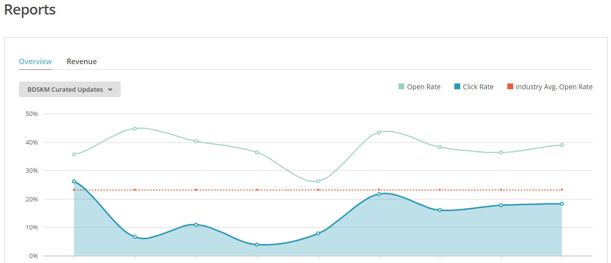
From what we can see, users make use of this curated news update. They do open the newsletter that hit their mailboxes regularly during the first week of each month. Out of the many different things you can monitor in MailChimp, we decided to focus primarily on open rate and click rate. As you can see from the image below, MailChimp provides you also with benchmarks and average for your industry, and we’ve been pretty happy to have an email open rate which has constantly been above what MailChimp consider the industry average.

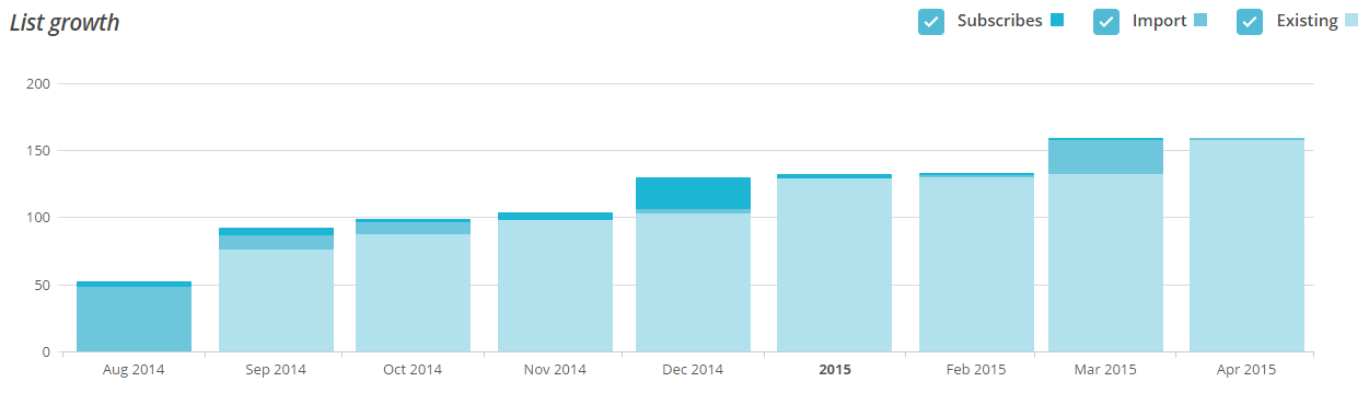
Besides the generally positive informal and anecdotal feedback that we receive from users, we can also see that the they appreciate the service: the list of subscribers keeps growing, in spite of the fact that we don’t do any active promotion of this service. So the list growth is all driven by peer recommendations and suggestions, with subscribers encouraging their peers to register for the service as they find useful to receive a monthly newsletter with a few, key resources that are already filtered and digested by experts, and whose judgement they can trust.

Are users clicking on the suggested links? 

In general, resources shared through the newsletter are opened and users go and read the original document. MailChimp provides automatic tracking of the links included in any newsletter. However, for some technical reason, this didn’t work at first with the RSS driven campaign, and we failed to properly track clicks on links in the first few issues of this Curated Updates service. So while figuring out the issue (which we did eventually, thanks to the great MailChimp support team) we started using Bitly to shorten the links for each curated update resource included in the newsletter.


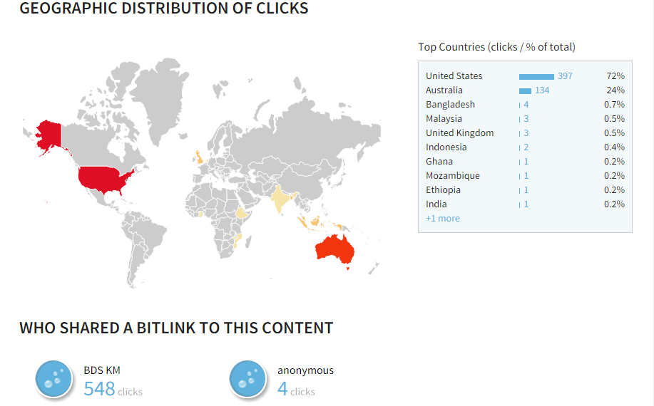
This gives a better idea of what resources resonate with our audience, where the click happens (if on the newsletter, on the website or elsewhere) and where the audience is located. Through Bitly, we can also see if the link is re-shared on other social media channels, allowing us to have better link tracking and potential insights into where our audience interact online.

How valuable are the resources? 

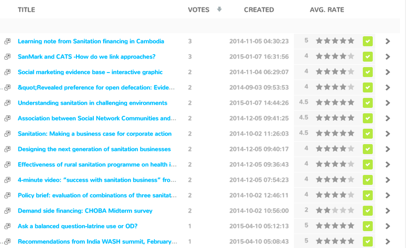
The RatingWidget Wordpress plugin allows us to get a better feeling of the usefulness and relevance of each single curated news item for the users, and to understand the appetite they have for different types of contents. As we’re using the pro-version of this plugin, the ratings are nicely collected and displayed in the RatingWidget dashboard, as illustrated in the image below.


As you can see, the number of votes remains low and we find it challenging to encourage users to make more use of this feature. However, we believe it remains a valuable addition to our M&E for this activity. Ideally, the perfect scenario would be to include the rating widget directly into the newsletter campaign, but this doesn’t seem possible from a technical point of view - or at least, we haven’t yet figured out how to do it!

Publish, review, adapt, publish...

This activity has been planned around a “publish, review, adapt, publish” cycle for 12 months, and indeed for each of the issues we’ve been publishing so far we’ve been tweaking and adapting the newsletter, the way we present the content in it and online, as well as some of the tools we adopt to track users’ behaviours and preferences. Each time, we try to learn something and put it into use in the next issue - the curators from a content point of view, looking for resources that resonates more with the audience; and us from a technical point of view.

We’re running the service for a year, which comes to an end in July 2015. As we review how it worked we’ll share what we learn and update our findings on this blog..

Friday, April 10, 2015

A curated news highlight service using Wordpress and Mailchimp

With all the news sources that are available out there and are populating our email boxes and social newsfeeds, how do you help reduce the noise to signal ratio? And how do you measure if what you’re doing is valued and used by the people that are benefiting from this service?

In work we are doing to support KM in the Building Demand for Sanitation (BDS) programme, we started to experiment last year with a selection of monthly curated updates about water, sanitation and hygiene (WASH). This activity came as response to the strong recommendation from BDS grantees about the problems of information overload and the need for support in navigating the flood of documentation and evidence.

We were lucky enough to find in Jonny Crocker and Shankar Narayanan two great curators, willing to work with us to identify 4 to 5 recommendations per month, curated and based on their own reading and selected from other peers’ recommendations.

But how to implement such activity?
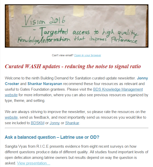
Screenshot from last issue of the Curated WASH updates

A newsletter, with some extra features 

First and foremost, we wanted something as easy as possible for users. And having run several interactions and surveys with them, we know that if we wanted to have some hope for success, we had to plan around email. So our WASH Curated Updates had to be an email newsletter.

But we also wanted to be sure that each curated resource could remain easily accessible and searchable, into a browsable online archive that would grow with the content posted in each issue. And that this library of resources could potentially be exported and included into other archives and datasets.

Finally, we wanted to give readers the opportunity to rate the individual contents we would post in the newsletter. Something easy to use and without readers having to be logging into any account, because we know this is a major barrier to participation for some.

How does our Curated Updates work?

After testing various options (for example, using a social bookmarking service such as Diigo, which allow users to rate each bookmark shared in a group, or Scoopit), we developed an online system that works as follows:

  • Curated Updates are posted by our two curators each month as blog posts on a simple Wordpress website (bdskm.net) - they are properly categorized, using a custom taxonomy for type of resources, geographical and thematic coverage; 
  • For each (short) post, the ‘read on’ link is shortened using bitly and brings users to the original resource, whether it’s an external website, article or PDF uploaded on the Wordpress site; 
  • The RSS feed from the Curated Updates section of the blog feeds into MailChimp to populate an RSS-driven campaign that goes out in the first week of the month to the newsletter subscribers; 
  • When subscribers receive the newsletter, they can read the full post and click on the link to read the original source. Alternatively, they can click to read each post online and rate it; 
  • The rating can be done on the website using the RatingWidget Wordpress plugin, which is displayed after each post and website page. 
So how do we measure if this activity is working well, and grantees are using the curated news put together by their peers? In the next post, we’ll present the tools and indicators we use in our basic M&E system.

Friday, March 27, 2015

Supermetrics: how to easily collect Analytics and YouTube data

Collecting and charting data from your YouTube and Google Analytics can be a time consuming process and not a very enjoyable one, as I’m sure you are aware of...But there’re some good news here. And it’s called Supermetrics.

What is Supermetrics? 

Supermetrics is a Google Drive add-on - an extension that you can add to your Google Sheets and Docs. Add-ons are similar to Google Apps Scripts but with some differences. If you’re curious to know more about this, go over this blog post here, where the two are compared in detail. And where you can also find a good overview of some useful Add-ons.


With Supermetrics you can create queries to (semi)automate your reporting from sources such as Google Analytics, Youtube, Twitter, Facebook, Google AdWords, etc….Data from these sources are added to a Spreadsheet (or Google Doc). You can then create live charts from these data, so they are automatically updated once you refresh your Supermetrics queries. Supermetrics comes with a free and pro versions.

The main two differences are about the amount of data you can get from each query and whether you can schedule automatic refresh of your queries, which is available only for the pro version (49 USD/month).

In CARIAA program M&E dashboard, we used the free version of Supermetrics.

How to activate and use Supermetrics?


To use this tool follow these simple steps below here:
  1. Activate Supermetrics - Navigate to the Add-ons button in your Google Sheets and browse the gallery to select Supermetrics.
  2. Set up your queries by 
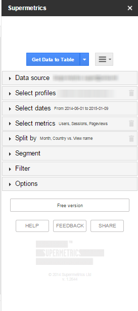
    1. Connecting your data source and selecting your profiles - Launch the Supermetrics sidebar and connect the various sources you want to monitor. In our case, we only connected the Google Analytics and YouTube profiles that were shared with the Google Account we used.
    2. Selecting the date range you want to monitor and the metrics you are interested in - In our case, we set up queries for a specific time frame but you can also have a year-to-date query, last month, etc...Out of the many Google Analytics and YouTube metrics you can collect, we limited the query to web sessions, users and pageviews for Analytics, and views for YouTube.
  3. Launch your queries and see your data - Once you’re all set, decide how you want to get your data, in a table or in the various default charts. Data will be downloaded and added to your spreadsheet.
  4. Refresh your queries - From the Supermetrics menu under your Add-ons tab, you can refresh all your queries with a click and update your results and charts.
  5. Launch Supermetrics from your Add-ons menu
  6. Modify and edit your queries - Alternatively, you can click on Manage queries; this will open a worksheet where all your queries are listed. From here you can manage and modify them, for example changing the date range of the query.

Using Supermetrics has proved to be a very effective and efficient way to collect usage stats and traffic data for multiple Analytics profiles and YouTube channels at the same time, without having to waste time navigating in and out these various accounts to get individual data.

Note that, while at the beginning of this post I mentioned that this tool can also be used to collect data from Twitter, in our case we decided not to use Supermetrics for Twitter.

In the next post, I’ll explain you why we took this decision, and what we used instead. In the meantime, if you haven’t try it yet, give Supermetric a shot and see for yourself how it works.

Friday, March 20, 2015

Power up your Google Sheets with Apps Scripts


Google Sheets and Docs are very powerful, flexible tools for data collection and analysis. But do you know that there's a lot more you can do with both Sheets and Docs, using free tools or just a bit of extra coding? And even if you are not a programmer? Do you know you can:
  • Enable users to edit responses they have made in Google forms? 
  • Automatically copy (part of) data from one Sheet into another one? 
  • Simultaneously collect various metrics for your Google Analytics, YouTube and Twitter accounts?
  • Automatically track Twitter posts around a Twitter handle, hashtag or search term?
  • Automatically count the number of Twitter followers of various accounts and add them dynamically into a Google Sheet? 

In this post and the next ones, I'm presenting few different options I’ve used to 'extend' Google Sheets and how I used them in the development of a program M&E system and dashboard for IDRC.

Today I'll look specifically at two possible use of Google Apps Scripts for Google Sheets.

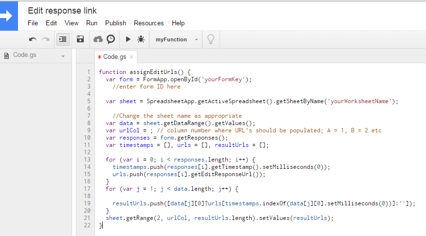
Google Apps Script editor

About Google Apps Scripts 

Google Apps Scripts "is a JavaScript cloud scripting language that provides easy ways to automate tasks across Google products and third party services and build web applications."

With Apps Script, there's quite a lot that you can do, such as write custom functions, create macros and menus for Google Sheets. Google itself provides quite some guidance on how to work with Apps Script, but sure this may not be easy for a total beginner.

Luckily, there's plenty of kind (and clever!) people out there that have developed Apps Scripts and make them available to others online. And those you can just use!

Use Apps Scripts to collect Forms "edit response links" 

In M&E system and dashboard developed for IDRC program, as we saw part of data collection is manual, with users inputting data for research outputs and pilots through a series of Google Forms. So what if users want to update/modify an existing entry?

If you are familiar with Google Forms, you probably know that responses can be collected into a Sheet. You may also know that you can set up your Form so that, after an entry is submitted, it sends an email to the person that has contributed that submission. The email contains a link that the person can click to in order to modify/edit the entry.

Well this is sure nice and useful!

But wouldn't it be better if the edit response links were also added to the Sheet where the responses are collected, nicely ordered in line with the relevant form entry?

You can do this, with this Google Apps Script I've found browsing online.

To use this Apps Script, what you have to do is the following:
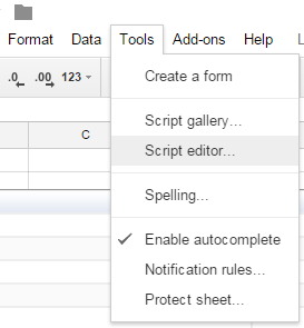
  • Click on Tools >> Script Editor in your destination Sheet (as in the image on the right);
  • In the Script Editor, copy this piece of code here
  • Change the parameters as indicated in the code; 
  • Save the script and run it; 
  • Click on Resources >> Current projects trigger and set the script to trigger at every new Form entry; 
  • Check that the edit response links are added in the right column on the destination Sheet.
Done! You set it up once and the script will continue to run and collect edit response links every time new responses are added via the form.

Importing data from a different spreadsheet using scripts

While this Apps Script is very specific for when you use Forms, there are few others that can come in handy in more occasion. For example, to automatically copy (part of) data from one Sheet into another one.

While you can actually do also this using in-line cells functions, as nicely explained in this post, I've found this to be not very reliable and not to always update automatically. So I would recommend to take the slightly more technical route and use Apps Scripts. You can find the link to the code and the explanation on how to insert this script.

Give it a try and see for yourself how it works. And let me know in the comments here if you are using other useful Apps Scripts that’s worth sharing.